Showing posts with label LabMaps. Show all posts

Wednesday, December 19, 2007

Thursday, December 6, 2007

Week 13 = 11/16/07


This map is the final product of our lab quiz. This map shows some buffered layers for Buncombe County. If you look hard enough you can see a layer for I-26, I-40, and parcels that are over 100 acres.

Week 15 = 11/30/07


This map is the finished product of our lab exercise today. As you may or may not could see this map has some buffered layers for Henderson County. This particular map shows some criteria that the city has added when trying to decide on a place for a new landfill.

Friday, October 26, 2007

Week 10 = 10/26/07 = Cherokee County Maps


The map on the left shows the Cherokee County with the aspect option of the ArcMap software. The map on the right shows the hillshade of the entire county. The different colors indicate the different hillshades for the county. Of hand I am not sure what the colors mean but if you would like to know then shot me a comment and I will get a legend on that map.


The map on the right shows a contour for the Cherokee County. This map was generated by taking the downloaded data and using the contour option in the ArcMap software. The map on the left displays the cut/fill for the entire county. The blue represents the net loss for the county. It is hard to tell but there is another color on the blue map. Pop quiz hotshot, can you tell me the other color?


The map on the left shows the hours of winter solstice for the Cherokee county. You aren't able to see it but the hillshade layer is underneath this layer. If you look real close you can kinda see it. This map does not show any title or legend on it. The map on the right shows the final version of the map on the right. This map has a title, legend, and miles chart. The map on the left is ready to be printed and used.

Friday, October 19, 2007

Week 9 = 10/19/07 = Spatial Exercises Map


This map shows the suitable locations for areas for a new school based on some conditions that were established in the calculations. These highlighted areas are away from existing schools and close to recreation sites. Due to the small size of the map it might be hard to tell that right now. If you would like me to display the calculations for displaying this then post a comment and I will display that image.

Week 9 = 10/19/07 = Chapter 12 Maps


The map on the right shows an area in which the trees are not able to be cut down and logging is prohibited. The map on the left shows both areas that are and are not able to be cut down. In theory these maps will be used to help logging companies. If you would like me to enlarge the images then post a comment and I will try to post the larger image.

This map shows the harvestable areas that have a query that was created to display just that area. The map didn't display all the way when I up loaded it. At the top where it looks like there should be circles is where there are circles that the query had produced. If yall would like me to display the circles then post a comment and I will hope for the best

Week 3 = 09/07/07 = Chapter 13 Maps


This map shows three different projected coordinate systems. All of the data frames are using the Albers Equal Area Conci projection but each data frame has a different coordinate system that defines it. This small of a map might be hard to read. If it is then click on the image itself to kinda get a better view. If you would like me to make the image bigger then post a comment about it and I will see what I can do.

This map shows which states have had the most growth between 1990 and 2000. It is kinda hard to see this map. I think if you click on the image itself it will display the map be itself and you might could see it better. If not, then post a comment about it and I will see what I can do.

Thursday, October 18, 2007

Week 7 = 10/05/07 = Chapter 9 Maps & Tables


This map shows a selection of metals pits that are most hazardous and the type of clean up for the pits. The different colored dots indicate the type of clean up. To be honest, I have no idea what type of clean up the colors mean. When I was exporting this image I forgot to make a image that defines what the colors stand for. For anyone looking at this map and want to know what the colors mean then post a comment on here and I will see what I can do.


This map shows a map that has three selected abandoned pits that are within a half mile of the Mississippi River. All three selected pits have had there tables appended to make one table or report for them.

Week 7 = 10/05/07 = Chapter 8 Maps & Tables


This map shows a selected parcel that is up for sale from about two dozen or more parcels. The table to the right of the map shows the attributes (asking price, zip code, address, etc..). If you are having trouble making out any of the maps, then post a comment on the blog and I will see what I can do.

The map of the left shows a group of parcels that are up for sale and that have a asking sale price of less than one hundred-seventy thousand. The table to the right of the map shows the attributes for the selected parcels in the map.

This report displays the sale price, how many square feet, and how many bedrooms each parcel has that is up for sale. I wonder if the company that owns them are able to do a monthly payment plan.

Friday, October 12, 2007

Week 8 = 10/12/07 = Chapter 11 Maps


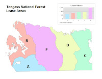
The tan colored map shows a section that has been aggregated into five lease polygons and the letter map makes it easy to compare the lease area values.

The first map shows a section that contains streams in it. The streams extend beyond this section but have been condensed down. The second map shows a selected section that is ready for data analysis. This map shows a section of Goshawk nests.

Week 8 = 10/12/07 = Chapter 10 Maps


This map shows a selection of neighborhoods that contain a shopping center in them.


This map shows a commerical zoned area that contains a shopping center. Of course the area is zoomed in to better show the shopping area.

Thursday, September 13, 2007

Chapter 3B Map

This map shows two distinct lines. The top line shows a planned flight plan and the bottom line shows the actual flight plan. Pop Quiz Hot Shot, One of these lines has a image of something at the end of it. Can you tell me what that image is and which line has it?

Chapter 3A Map


During the semester, I will be posting images of some maps for the ArcGIS lab book. This image is from exercise 3A step number twenty. To be honest, I think this is the overview of a flight plan that someone had took.